Built to stand out on the shelf.
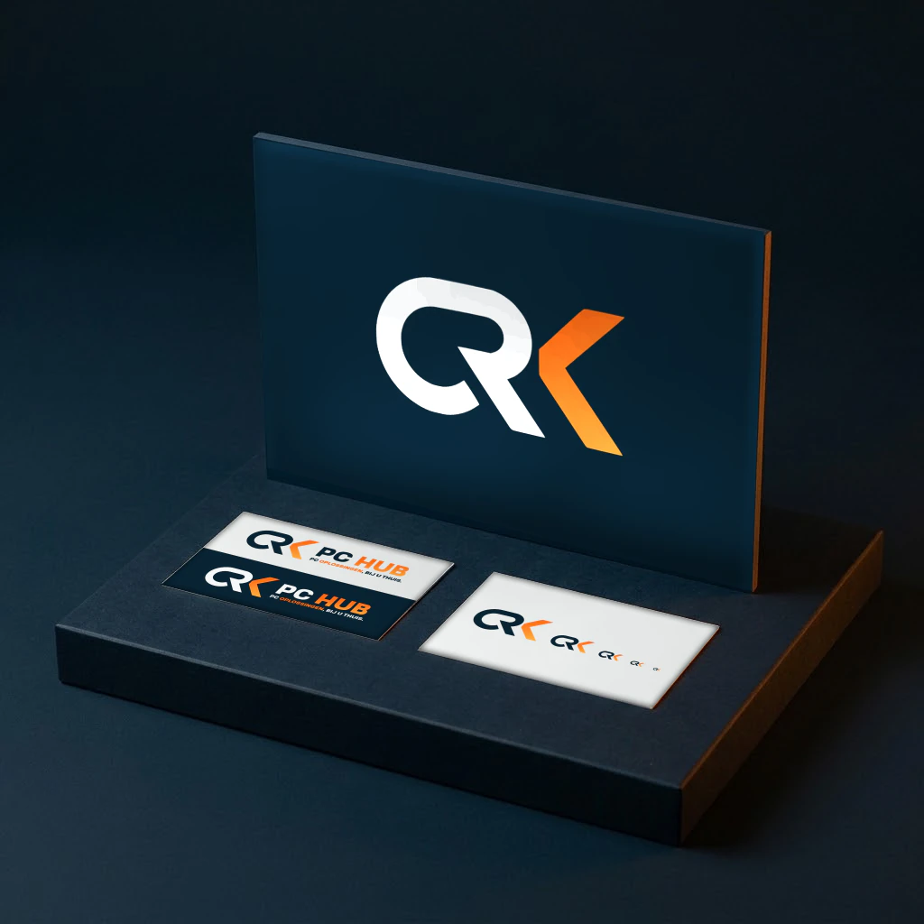
A ground-up brand identity for a tech hardware retailer in a market of look-alikes.
01The challenge
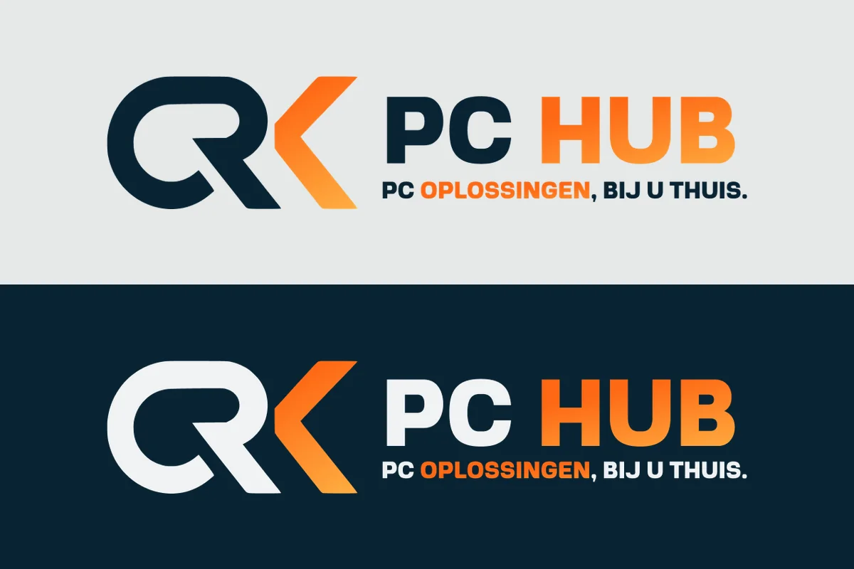
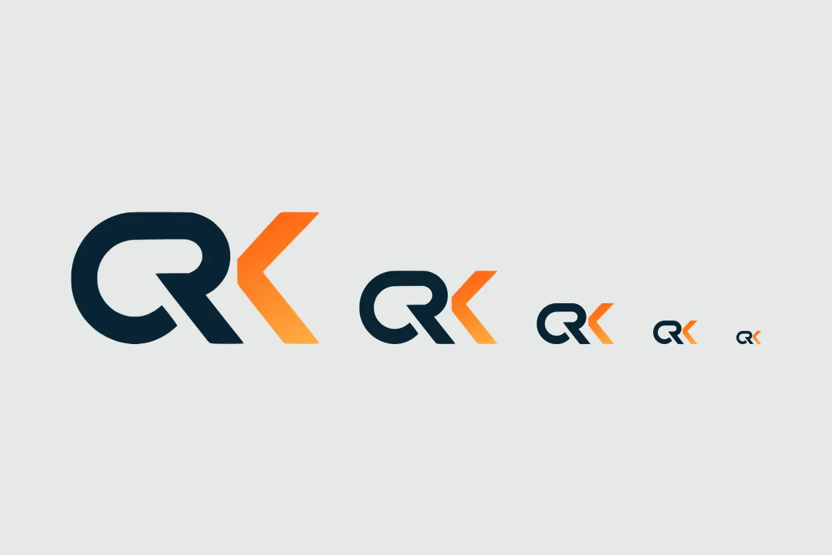
Hardware retail is a wall of identical logos. CRK needed a mark that reads tech-native and premium at the same time.
02The approach
Quick response, clear expectations, iterations until the founder was fully satisfied. Goal-oriented and meticulous, in his words.
03The outcome
A logo the founder was completely satisfied with, and '10/10 recommended' in his own words.
Work in motion · design, messaging, experienceWork-in-progress available on request
04The client
“I contacted Aktify about creating a logo. I received a very quick response. Adjustments were made upon request until I was completely satisfied. A very goal-oriented, meticulous, and determined approach. 10/10 recommended.”
Cem R. Karaca · Founder, CRK PC Hub
Want an identity like this for your business?
Apply in two minutes, with no commitment. We answer within 48 hours.
Next casePerformatchOne baseline for every touchpoint.